Tuesday, 6 November 2012

Geometrical Print Development

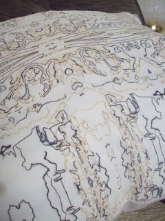
After drawing from a selection of research and primary source objects I chose a few things to use as a screen print. Here are some of the negatives from the designs Ive selected.


The first drawing is of the mac keys from my research. I drew it twice in different formats and since I drew it in fine liner it showed through to the next page so I decided to trace it. Which is why some letters are backwards. The second image is a triangular print which fills some of the keys. The designs are done separately so that I can do a two colour way print.


This design was taken from a loose hand drawing of honeycomb. I filled in some of the blocks to add colour to the print rather than just line.


This is a primary source drawing of a keyboard. I drew one of the letters from the keyboard but kept it separate so that I had the choice whether or not to overlay it with the keys. Rather than narrowing down my choices.


Geometry

Choices of themes for the skills for making brief were subterranean, geometrical and folklore. I chose Geometry. To source inspiration for the final print design I looked on websites such as Pinterest (which I love - http://pinterest.com/adelleroe/ ) WGSN and style.com. As well as using periodicals like ShowDetails. These are some of the most inspiring images I found.


Although the final design is for a garment front I also researched other specialisms including ceramics, jewellery, fashion, furniture and illustrations. As a primary source drawing I used an  old typewriter as I thought the repetition of keys were interesting and contrasted to the modern mac keyboard.

Wednesday, 4 July 2012

Beadwork @ The Shipley Gallery.

It took two attempts to get here as I couldn't find the gallery the first time. Totally worth it though. Its probably my favourite exhibition this summer. Particularly this dress...


It is appealing to me because of the combination of bead work and the folded fabric manipulation. As well as the colours. I think yellow always compliments grey well.

The Baltic & Lazarides.

I went to see some exhibitions at the Baltic this week. There was an interesting installation by Richard Rigg. It was a mountain hut full of mud, wood and other bits of debris. You could climb in and walk around. I enjoy installations that you can be in amongst. It reminds me of the first exhibition I went to see at the Batlic by Yoshitomo Nara. However, I wasn't allowed to take any photographs!

I still made the most of my new camera and got some pictures of NewcastleGateshead Quayside from the glass balcony. Shame the weather wasn't better.


I was passing the Millennium Bridge as it opened....


I then made my way to Lazarides, The Outsider's Gallery. I love their space. Its so different to other galleries and gives a more relaxed feel.


I was most interested by the work of street artist, OakOak. http://oakoak.canalblog.com/
They use everyday signs and objects in the street and interpret them in a different way. They also made a whole alphabet using photographs of signs and road markings which I thought was very imaginative.
 A wind-up toy mouse out of bike locks.

 A piano out of door steps.


A fish skeleton out of a drain.


Wednesday, 13 June 2012

Print Trends - Geometry.

 Geometrical shapes and colourful triangles are a current trend in both fashion and home. I found these interesting images of geometrical shapes and patterns on 'Pinterest'.


I found this image (above) the most interesting of all as it is structure rather than a painting or a print. It would've been built this way for a purpose rather than a trend and I think it is very creative of the photographer to take the photo from this perspective.


I found that geometrical prints often involve triangles. However, they also include shapes such as hexagons and rectangles which are made up of, or broken down into, triangles. They are often very colourful prints and often include the primary colours: red, yellow and blue.

I found this sample below from a company called 'Design des Troy'. I like how the shapes are made up of lines which intertwine to make a cross-hatch and blend the colours. - http://design.des-troy.com/


These wallpaper print and cushion designs are the creations of MiniModerns. http://www.minimoderns.com/
They are slightly different to the other geometric designs as they are a much more neutral tone with a dash of colour. However, the way they use one idea and come up with an array of designs to produce plates, cups, wallpaper, cushions and more is genius.


This pattern is the work of KayaJoy.  Her work can be seen here - http://www.spoonflower.com/profiles/kayajoy


Wallpaper designs for Kate Usher Studio.

This was the first motif I made on Photoshop using a scan of loose hand drawing I did. I multiplied the layer, and arranged it into a circular shape. I made the lines purple to fit in with the colour scheme I had chosen. I think the final result slightly resembles a floral design.


This motif was made using the same idea as previous. I like the way the overall shape is like a star because it reminds me of a starfish, which is still fitting for the theme. However, when I tried to put this into a pattern it wasn't overly successful. I ended up putting the inside shape of the motif into a multi-directional repeat and used filters for the background. I think with more effort and experimentation, this motif could've been a much more successful pattern.


In the developmental process I studied the pattern of a shell. I ignored the shape and tone then did a line drawing of the markings on the shells. I put this into a repeat and added colour in the background. This could be further developed by using it as a background to layer up with other motifs or repeats.


Out of all my designs i think this one is most suited to be used as a wallpaper. I used a basic repeat as the background and then added the same motif in a larger scale and different colours in a layer on the top. I felt this was my most successful motif to use in repeat and therefore this is what I used in my final collection of wallpaper designs.

For this design I contrasted the colours between in the inner and outer circles of the motif. At a review it was suggested that I experiment with this design but adding a shell in the centre of some of the motifs or by using a crystallise filter. I tried both of those suggestions but preferred the design as it is.


I developed the previous design further by experimenting with the scale of it and by creating a pattern in the design by altering the colours of the rows of shells. This is my favourite design. However, I think it may be more suited to a fashion print as a summer dress or a print on a duvet cover as opposed to a wallpaper.

Thursday, 3 May 2012

British Craft Trade Fair

I recently visited the British Craft Trade Fair in Harrogate. Here are some of my favourites from the show..

J.C Middlebrook.
J.C Middlebrook gives a new meaning to the word 'necklace' with her beautiful wearable lace art. She also makes collars, cuffs, cards, napkin rings, book marks and brooches.
http://www.jcmiddlebrook.co.uk/


 Plus 2 Designs
Vintage inspired paper lampshades and ceramic clocks.
www.plus2designs.co.uk


Sarah Louise Claire
Print and embroidered homeware, fashion and accessories.
www.skylarctextiles.co.uk

Emily Notman
Mixed media artist, uses clay, stitch and imagery.
www.emilynotman.co.uk


Vanessa Conyers
Vintage and floral inspired ceramic crockery.
www.vanessaconyers.com

Yu-Ping Lin
Felt jewellery inspired by origami and Chinese paper art.
www.yuxiart.com

Monday, 30 April 2012

Drawing Techniques.

All my work starts off as an initial drawing. I try to use a varied range of media but I tend to get stuck in the same rut of using left hand, blind, continuous line and loose hand. I also tend to only use a black fine liner, sharpie, stick and ink and a pencil. I feel my drawings and design development will benefit from a different range of media, possibly wet or coloured? And also a wider range of drawing and mark making techniques. I've decided to publish my favourite and most inspiring styles of drawing from other artists here, as a permanent, on-line reference. Here's the start....

Sandra Suy illustrates woman in sepia tones yet leaves the skin the same as the paper. She adds small splashes of colour in some of the garments. This is my style of drawing as I tend to shy away from colour but I think a small insert is manageable.


Leigh Viner is an artist, illustrator, make-up artist and blogger! -http://leighviner.com/
the most beautiful part of her illustrations are the eyes. She probably analyses this in more detail compared to others due to her career as a make-up artist.